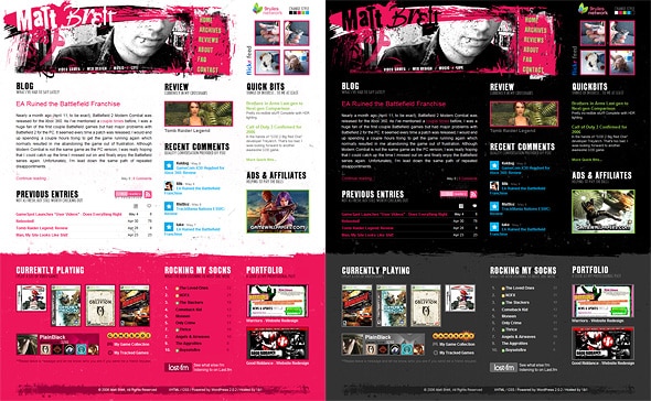
Back in Black

I’ve accomplished something I’ve always wanted to do with my site - have multiple styles and let the user choose their preference. As promised, I deliver onto you, “Back in Black”, which is essentially my latest revision with the old colours. A bit more bold, as all the links are coloured where as they were only underlined with colour in my previous incarnation. The style switcher stores a cookie on your computer, so every time you come back (granted you haven’t cleared your cookies) you’ll see the style of your choice. Fun!

Pretty in Pink and Back in Black styles


I’m a one-stop-shop for killer websites and blogs built on top of the best open source CMS out there, WordPress. Interested in hiring me for your project?

Design & Development

Featured work from my portfolio.

Reader Commentary

26 people have had something to contribute so far.

Monday, May 8th, 2006 at 5:13pm

AC/DC rules!
Lol, just kidding.
Congrats, this one looks even better than the pink one, but “Pretty in Pink” is just a little more peaceful ;)

Reply

 
Nao
Monday, May 8th, 2006 at 5:28pm

Awesome.

With this “Back in Black” one, the “Currently Playing,” “Rocking My Socks,” and “Portfolio” headers on the home page have text visible behind them. Correct me if I’m wrong, but I doubt that’s what you intended on doing (You can see it in the screen shots that you posted).

Reply

 
Monday, May 8th, 2006 at 5:32pm

Awesome. Excellent job switching it up!

I wasn’t happy with the White. Too bright maybe :P

Reply

 
Monday, May 8th, 2006 at 5:40pm

i did sumit like this on my old site , yours is much more pimp tho

Reply

 
Monday, May 8th, 2006 at 6:15pm

I like the black version much better, did you think about using javascript for an instant style sheet change?

Reply

 
Matt
Monday, May 8th, 2006 at 6:33pm

@Nao: Thanks for pointing that out. Totally missed those. The image replacement technique doesn’t work so well when you’re using transparent images, so I hide the text by making it the same colour as the background. But I must have missed those ones.

@Robert: Yeah, I was playing with a couple different switchers last night. One JS and one PHP. Problem being, I need to make some template changes as well. I’m going to try and replace things that prevent me from using a simple JS/PHP solution when I get a chance.

Reply

 
Monday, May 8th, 2006 at 8:39pm

Nice job Matt!

I hate to say it, but I’m Back to Black. ;) The pink was well done, but too bright for my taste. :)

Reply

 
Monday, May 8th, 2006 at 10:03pm

This version rocks!! Great job. Thanks for giving us a choice.

Reply

 
Tuesday, May 9th, 2006 at 3:18am

I’m with Thom, I’m back in the black (in both senses of the word!). Nicely done

Reply

 
Tuesday, May 9th, 2006 at 5:27am

Don’t get me wrong, the white site rocks, but im back in black as well, it feels alot more “comfy”

Reply

 
Tuesday, May 9th, 2006 at 8:01am

I like the black template better. It’s so cool:-)

Reply

 
Tuesday, May 9th, 2006 at 8:57am

Lookin’ very slick Matt. I must say that I’m also much more fond of the black layout.

Reply

 
Tuesday, May 9th, 2006 at 9:01am

Matt, I hope you’re keeping the stats of the people clicking the switcher, to see how many prefer the black one.

Reply

 
Tuesday, May 9th, 2006 at 9:19am

No way man… stop messing with your website and making us all look lazy ;-)

Cheers for the switcher, I haven’t decided which version to use yet, perhaps a lighter font colour on the the elctric pink would soften the comments area and improve the contrast a little? That could be a clincher for me…

Not picking holes, just a suggestion… also laughing my ass off at “None More Black” in your playlists…

Kinda ironic huh?

Reply

 
Tuesday, May 9th, 2006 at 9:49am

Matt, so did you write your own solution for the switcher, or did you use another one out there. If so, which one? I have been wanting to do the same thing with wordpress also. Awesome by the way. later.

Reply

 
Tuesday, May 9th, 2006 at 10:55am

I am such a fan of the “pretty in pink” site. I also think it’s awesome that you put the “Back in Black” site up for those who fell in love with your darkside. I could walk into the next room and tell you that, but I wanna comment too, I feel left out!

Reply

 
Tuesday, May 9th, 2006 at 11:20am

the pretty in pink version was a nice scheme but the black version is a little bit easier on my eyes for some reason. but i just prefer the site in black anyway

Reply

 
Mike
Tuesday, May 9th, 2006 at 3:01pm

@Deanna - Is that like IMing when dinner’s ready?

I’m a fan of both. I think black at night (since I’m in a fairly dark room) and pink in the day (since I’m in a room with a lot of light).

Reply

 
Tuesday, May 9th, 2006 at 4:52pm

Awesome. I have an easier time reading this one.

Reply

 
Tuesday, May 9th, 2006 at 5:32pm

Matt - the site is now perfect.

Reply

 
Tuesday, May 9th, 2006 at 6:32pm

well matt, i’m sticking to the white/pink one, i still love it

Reply

 
Wednesday, May 10th, 2006 at 10:45am

Yeah I agree with Trovster… would be interresting to see how many users go “back to black” :P

It’s my pref.

Reply

 
Wednesday, May 10th, 2006 at 5:25pm

That’s sweet. One thing you may want to work on is the button used to switch styles. When I first saw it I thought that by clicking one of the colored squares I could change the scheme to that color.

Reply

 
Thursday, May 11th, 2006 at 6:57am

Awesome site.. Like the Change style app :))

Reply

 
Design Freak Subscribed to comments via email
Thursday, May 11th, 2006 at 10:28am

awesome site dude!! am loving the design !! have a question for you !

how on earth did you manage to get that “Previous Entries” to work on the main page … it looks sooo clean and slick..

would love it if you could share some knowledge
thanks a ton,
T.

Reply

 
Sam
Thursday, May 11th, 2006 at 3:07pm

You should set up a poll or (even cooler) use a lil PHP magic to send data to a database when a user changes the style (and to take it further make a pepper to grab this data) so you can get some stats about who’s using which style.

Reply


Leave a Comment

Standard rules apply: Try and use proper markup. Keep it relevant. Don’t be an asshat.